Here is my final music video to my chosen song of David Guetta - Repeat (Feat. Jessie J)

Wednesday, 28 March 2012
Final Music Video
Here is my final music video to my chosen song of David Guetta - Repeat (Feat. Jessie J)

Sunday, 25 March 2012
Images Of Filming
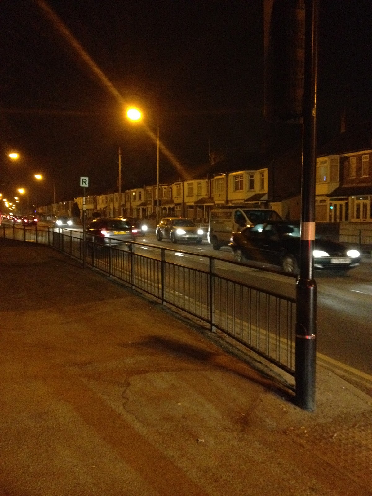
These are some images of how I placed the camera and also some images of where the locations was and what they looked like. All of these images was down busy streets, and they all included plenty of traffic to give the effect I wanted in my video. I used a tripod on all my shots.




Wednesday, 21 March 2012
Photo's For My Ancillary Text
When taking photo's for my ancillary text, I made sure that I tried to get a range of shots, this was so I wasn't stuck when creating them both and had lots of pictures to choose from so they didn't get boring. I wanted all the photo's to be in the same outfit and I also wanted them on a plain background so it would be easier to edit them and make them look more professional.


These are the images that I actually used in my ancillary Text ^^. The reason I used this images is because they are clear and was easy to edit, they also went well with the theme and I thought they worked really well with the whole CD's theme. Here are some of the images I took but did not use...


Tuesday, 20 March 2012
Font Idea's
J E S S I C A J J
This is my first font idea, the reason that I like this font is because its simple and easy to use, its easy to understand and it looks effective. All this font is a simple Ariel font in capitals with spaces, this means again thats its easy to do when im creating the cover. The bad thing about this font is that it could be seen as too simple but I like the fact its simple yet still effective.

Janda Safe and Sound is what this font is called from http://www.dafont.com/. I am not so keen on this font as its too bold and I dont like the scribble effect as it doesnt work well with my dance artist. I think its good that its all simple and bold so it would be eye catching to the customer, but it doesnt work well as it looks handwritten meaning this would be good for a acoustic act.

This font is called Qebrada font and again is from http://www.dafont.com/. This font is good as it works well with my Genre which is Pop/Dance. I think one of the bad things about this is that its a little see through and you cant see much, it doesnt work well with the design I wanted to do and I think its a little like a shadow, instead of a block font. It doesnt stand out too.
 Blackboard font is again off http://www.dafont.com/. I do like this font but its more of a Rock genre look and I dont think that it would work well with my music video. I think its a little haunted looking too and I think that it wouldnt work well at all.

Monday, 19 March 2012
Health & Safety Considerations
Health and safety is very important when creating a music video, this is because we don't want any accidents happening when filming, meaning that no one should get hurt and also that I don't injure myself when filming. There are many things to take into account, like making sure that there are no wires anywhere; this could easily be a danger as when filming there will bound to be wires around, its best to tuck them away and make sure me and my artist are aware that they are there, this way no one should get hurt. Also if there are wires anywhere that don't need to be there, then take them away completely, this will reduce any accidents happening. Another issue I could face with health and safety is the locations we are visiting, these locations can get busy and I will want to be filming on the night, the health and safety considerations will be making sure its not too late and that we know the area well. My artist is also wearing some high heels so its best again that we make sure that she doesn't fall over and that we don't go to places in which it could be too hard for her to walk, another thing could be that when not filming we take them off her feet and have some rests during filming. Since there is also a lot of dancing and physical movement, its best my artist is feeling good and healthy, so its best that she is well hydrated and also not feeling ill, I will make sure there is plenty of water when filming.
Hazard: Falling over whilst dancing
Who Is At Risk: The artist and anyone around, so me filming, or anyone just walking by.
Controls: Wearing flat shoes to make sure they dont trip up.
Chance Of Injury: Very Low
Control Measures: Flat shoes, plenty of water to make sure that the audience doesnt faint or feel ill.
Hazard: Tripping over wires and cables
Who Is At Risk: Me and the artist
Controls: All wires must be tucked away
Chance Of Injury: Low
Control Measures: Making sure that I warn my artist where the cables are and also if there are wires and cables there that dont need to be, put them away.
Hazard: Falling over whilst dancing
Who Is At Risk: The artist and anyone around, so me filming, or anyone just walking by.
Controls: Wearing flat shoes to make sure they dont trip up.
Chance Of Injury: Very Low
Control Measures: Flat shoes, plenty of water to make sure that the audience doesnt faint or feel ill.
Hazard: Tripping over wires and cables
Who Is At Risk: Me and the artist
Controls: All wires must be tucked away
Chance Of Injury: Low
Control Measures: Making sure that I warn my artist where the cables are and also if there are wires and cables there that dont need to be, put them away.
Wednesday, 14 March 2012
Shooting Schedule
This is my shooting schedule, this is the way I shot most of my scenes and made sure that I had time to film them and check the locations of them all. I have added in the dates and locations too.

I have updated this last minute to show the scenes where I filmed where the traffic is going by, I did do some last minute filming and this is now updated on the shooting schedule.
Digipack Promotion

This is what my digipack that I was going to use, would have looked like in iTunes, by looking at this compared to the others you can see a big difference, the difference being that the rest of them do have the artist on the front. I think I will have to change my idea and make sure that my artist is easy to see and its clear that its that person on the front other wise it wont stand out. I think the font that is used is good and I like the colours to it, but I also think it would be hard to keep a theme going, as there is too many colours that could be used for it, and it would be hard to make it all a theme.
I am glad I am changing my whole idea otherwise it wouldnt have the typical dance genre conventions, and wouldn't look realistic. I also think that the quality of the album artwork is not clear and the layout could be done better in order for it to stand out in front of the audience.
Subscribe to:
Posts (Atom)